
Every couple of weeks, new tools are released that promise to make our workflow faster and more organized. Once in a while it’s even true, but regardless of how good the tool is, it still takes time to learn it.
Not long time ago my company started using the DSM platform by InVision to build the Design System. InVision releases new features periodically and the DSM team looks carefully at the ones that can make our teams more productive and efficient. Below is the list of seven tips I would like to share with you about using our design system.
1. Difference Between Web View and Sketch Plugin
The DSM platform can be accessed in two ways: web view or sketch plugin.
Web view is the main view where everyone from the company may see the library with all components, documentation of usage, visual examples and the React code sources.
Sketch plugin view is a technical tool for designers. The goal of it is to enable reusability of components which improves productivity of designers.
2. Just drag & drop components
Once you’ve installed the DSM plugin in Sketch, open the library by clicking to the DSM icon and start searching for the component you need. Then simply drag and drop it to your sketch file.
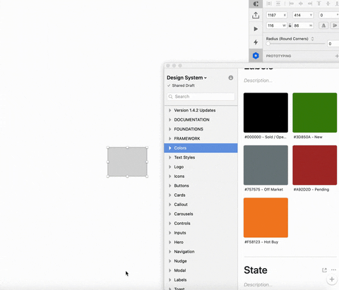
With text styles and colors it’s even easier. Just select an object you’d like to modify in Sketch and click on the Color/Text Style in the DSM panel.
3. Always apply text styles from the DS type ramp
Make sure that every text element in your designs has an applied text style.
Applying the text styles from the DSM will help to avoid inconsistencies in font sizes, line-heights and letter-spacing. Thanks to the DSM integration with the InVision prototype, using the DSM text styles in Sketch will help developers apply the right style during the design implementation.
4. All our components have guidelines
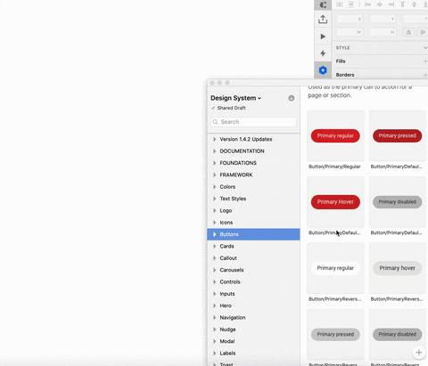
Each component class i.e. buttons or text fields has documentation about its usage. The short overview can be found in the DSM panel together with a link to a more detailed description on the documentation website.

5. Easily adjustable subcomponents
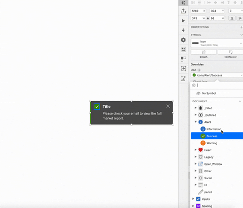
We built components using the atomic principles. Starting with small elements i.e. icons or checkboxes we build up more advanced components like text fields or cards.
It would be very impractical to list all possible permutations of designs for higher level components therefore the library may contain only a specific example of it. Having said that, you may easily adjust and change its subcomponents in Sketch. For example let’s imagine we have Toast component and we want to set the warning message, then we’d drag & drop the toast component from the DSM and we could go to change the warning icon using the right Sketch panel.
6. Never detach the Symbol
It’s really important to never detach the symbol! Doing so will break the component by removing proper syncing with the DSM library; that means the component won’t get updates in the future releases.
If you truly need to adjust higher level component, you can simply hide content you don’t need using the side panel while keeping the base element. Then on top of it, you can build whatever you want!
7. Sketch will automatically adjust spaces for you!
Since we built the DS components using the smart layers function, Sketch will now automatically adjust spaces within your components.
For example in Modal component you need to use only text button, so using the right Sketch panel, hide the primary button. The spacing of the text button will adjust automatically.

Amsterdam, Netherlands